03.03.2017
Currency Trading Charts, A Complete Guide

Currency or Forex trading is almost exclusively undertaken on-line in the modern marketplace. Investors can trade seamlessly from their desktop PC or from a mobile device using the same platform and login. See our platforms page for details.
Modern technology has put the trading environment and associated data quite literally into the palm of our hands. The best way for many investors to keep track of and understand this data is via a Currency Chart.
A chart is visual record of the price action of a currency pair or other instrument, that is drawn over a fixed period of time. For example a week, a month or a quarter. The Currency Chart records the rise and fall of the price of a currency pair or cross. Which means traders can easily spot and identify traits, such as support and resistance levels and high low points in the price, during the period the chart is drawn over. The use and study of charts is known as Technical Analysis – this discipline sits somewhere between an art and a science. The charts themselves being mathematically derived whilst their interpretation can be a subjective thing.
Chart types
Modern trading platforms such as the Blackwell Trader MT4 offer their users a high quality charting package as part of the software. These tools are available free of charge are intuitive to use and yet are highly configurable. To the extent that they can be customised to meet a client’s specific requirements.
That said currency charts will usually take one of three standard formats these are :
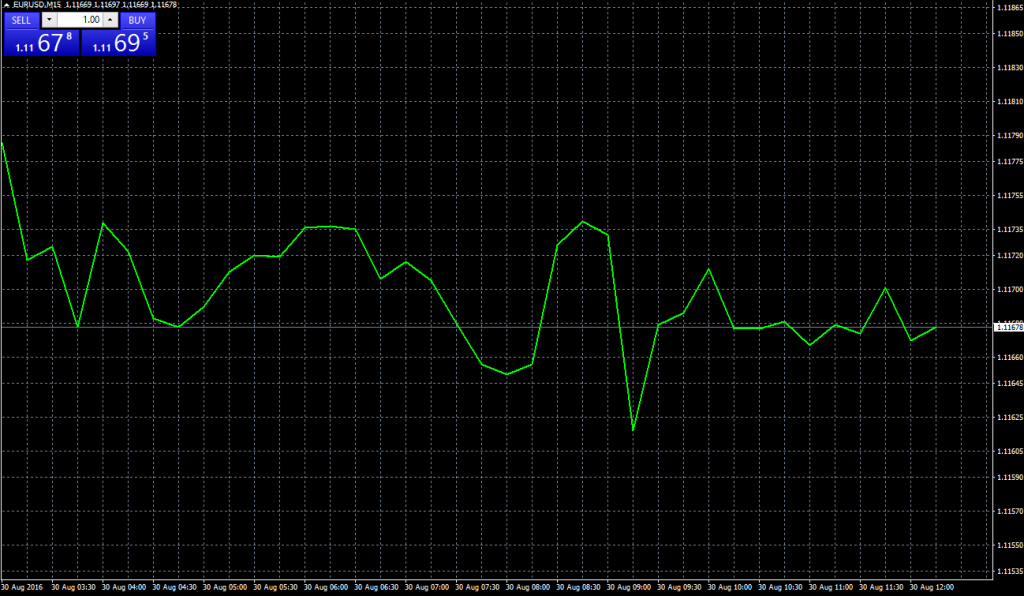
- Line chart : A line chart is the simplest form or plot of the three styles. The line records the price of currency pair or other instrument at fixed points in time for example every five minutes.The line chart is effectively joining together a series of points or plots, drawn at the end of the specified period,which are displayed in chronological order. This type of data is known as a time series : See the image below.
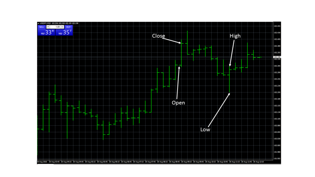
- Bar chart : The bar chart is a more sophisticated method of recording price data, of for example, a currency pair. The bar chart contains more information than is displayed in the simple line chart. Bars are drawn vertically and once again track price changes for a given length of time, for example over 15 minute periods. Each new bar is displayed to right hand side of the prior one i.e. in a time series. Rather than just being a series of discrete points on a page, the bar chart captures the high price, the low price, as well as the opening and closing prices of the instrument as at the beginning and end of each period measured. The high and low points represent the top and bottom of the bar whilst the open and close form horizontal pegs attached to the bar. (Note that the positions of the open and close pegs are determined by direction of the price during the sample period). The additional data recorded in the bar chart means that users can make now direct comparisons between individual periods and the data points contained within them. Potentially allowing them to identify trends and other price patterns. See an example below.
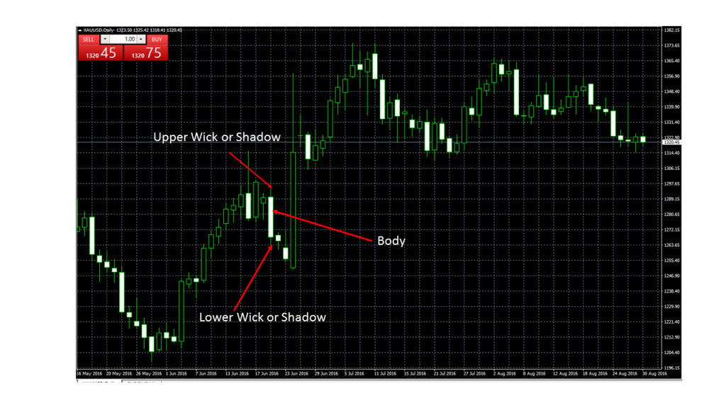
- Candle chart : Candle charts are in effect an extension of the bar chart. Though they were developed independently of them and have their origins in the rice markets of 18th century Japan. The candlesticks, as the individual objects within a candle chart are known, are usually comprised of a body and two wicks or shadows. Each candle records and displays the high, low, open and close data for a given period of time. However candles have an extra dimension than the markers in a bar chart and a such as can impart more information. For example the candles body is often colour coded to reflect whether the price of the underlying instrument rose or fell in that period. Classically a white or unfilled body represents a price rise during the period recorded whilst a black body in the candle signifies that the price fell during the period of observation.(Other colour schemes may also be used). The size and shape of a candle’s body will also vary, reflecting the size of the price range within the given period. As such candle charts often form patterns that traders look for and use as an aide to their trading.
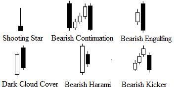
Some examples of candlestick patterns
Thanks to their Japanese heritage candle
stick patterns have some exotic sounding names, some examples of which can be found below.
These are just a few of patterns that Technical Analysts look for. And spotting and interpreting them is the art form within the discipline. A subject on which may papers and books have been written.
Drawing lines
Many traders like to draw lines on their Currency Charts. They do this to help them visualise what has happened and what may happen in future to the price of a currency pair or other instrument. These lines would usually fall into one of three main categories which are.
- Trendlines: A trend line is used to describe a prevailing price trend in a instrument. The trend line connects a series of higher or lower highs, or higher or lower lows depending on whether you are plotting an up or downtrend and or the top or bottom of that trend.
- When drawn on a candle chart the trendline will be drawn, or placed, so as to connect upper or lower wicks and will classically connect at least three points via a straight line. Two parallel trendlines, one above and one below the charts candles are sometimes drawn to visualise a trend channel. Trend lines and channels are often extended beyond the lifetime of the current chart, in an attempt to predict the future path of price action. Price moves above or below a prevailing trend or channel are generally of a great interest to Technical Analysts and traders.
- Support and Resistance : These lines are often drawn across the main body of chart to highlight areas in the chart, at which the price of the currency pair has encountered a barrier. In the case of a move lower which is curtailed, this barrier is known as support. Whilst a price barrier encountered in a move higher is known as resistance. These barriers can be formed at the same price point on subsequent occasions, within time series data, forming horizontal support or resistance. Or if they occur during periods when the price slopes away, either higher or lower then they will be considered as trend support or trend resistance.
- Fibs, Fans and Scans : These are lines that are often drawn using a specific mathematical criteria. For example the Fibonacci series . They are used to measure previous price action and make predictions about future price behaviour. Other studies such as Gann fans apply geometry(via a fan of nine lines) to a price chart to identify existing trends and potential future price direction. Other linear studies include Andrews Pitchfork and Cycle Lines.
All of these studies and more are included and available free of charge in our trading platforms charting package. You can register for either a live trading account or a free demo trading account by clicking on these links. Once you have opened your account simply download our free state of the art platform Blackwell Trader MT4 which is available for both PCs and Android or iOS mobile devices. Once done you can start creating and exploring your own Currency Charts.
Indicators
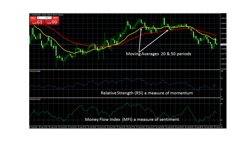
Traders will often add indicators to their currency chart to allow them to get a better understanding of how the price action is performing and to predict what may happen next . Blackwell Trader MT4 is preloaded with literally dozens of indicators, many of which can be configured to meet user specific needs In general these indicators are designed to track one of three main types of variables which are the sentiment towards and the money flow into an instrument. The price momentum of the instrument and the speed at which this develops or disappears. Or the instruments price performance relative to a price average or other statistical measure and whether these averages are themselves rising, falling,converging or diverging. The image below shows a selection of indicators applied to a currency chart.
Blackwell Global clients can explore currency charts and the wide variety of indicators within our trading platform by opening one of our Demo trading accounts and downloading our Blackwell Trader MT4 platform. You will then be able to create as many different Currency Charts as you wish. Mixing timescales chart styles and indicators and familiarise yourself with drawing trendlines and identifying support and resistance levels etc.
Back to Previous Page >>
